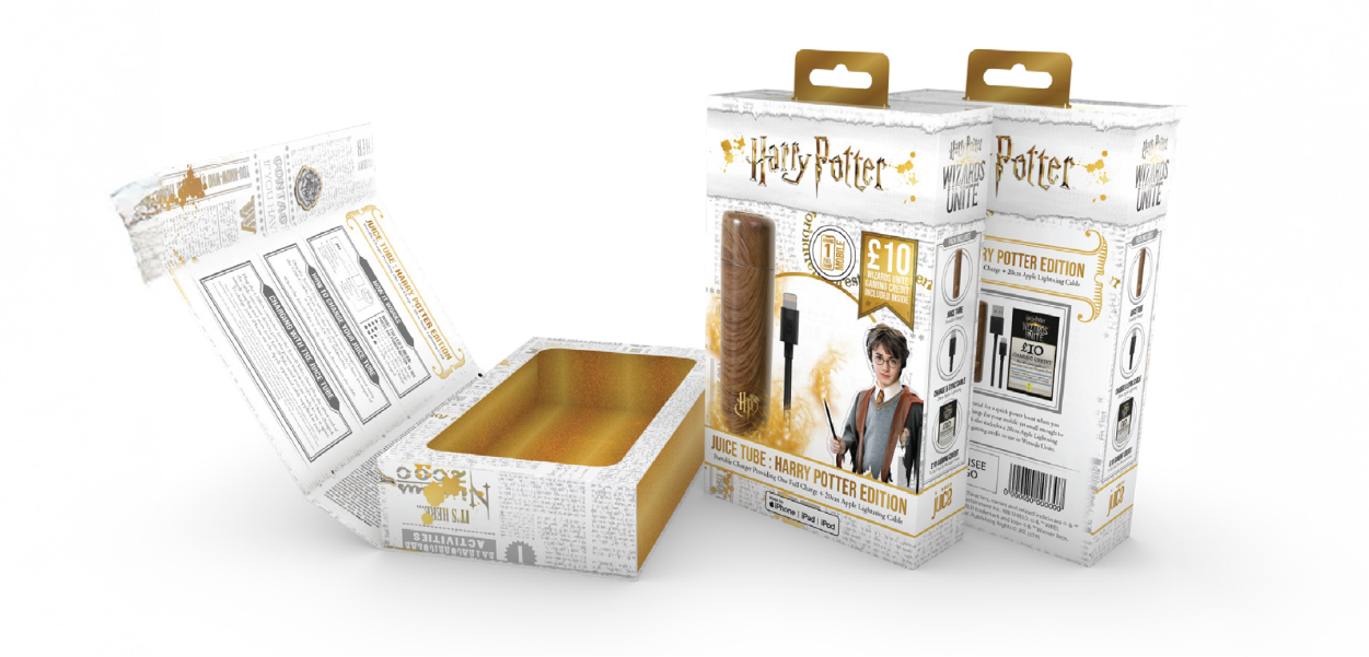
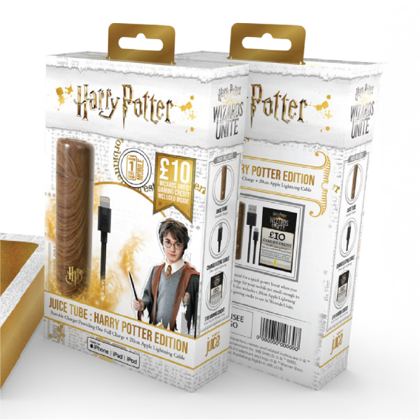
About The Project
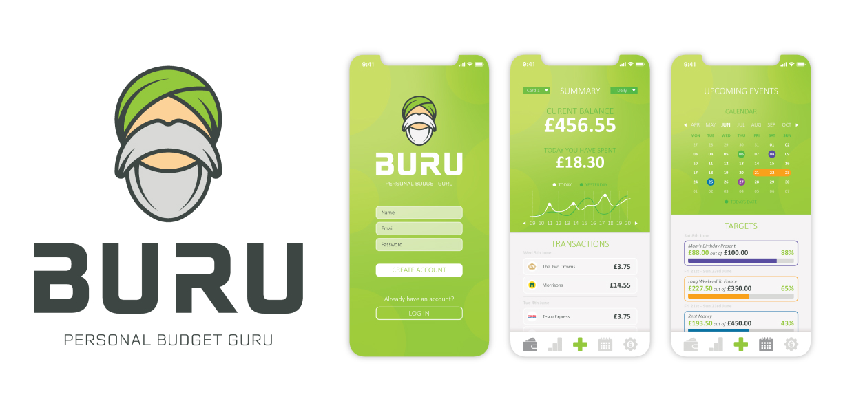
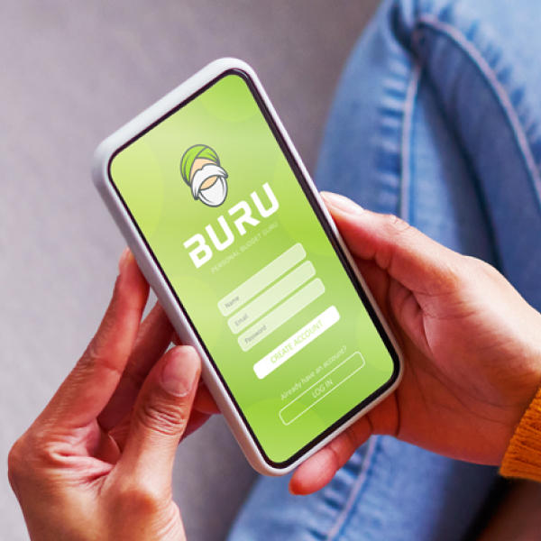
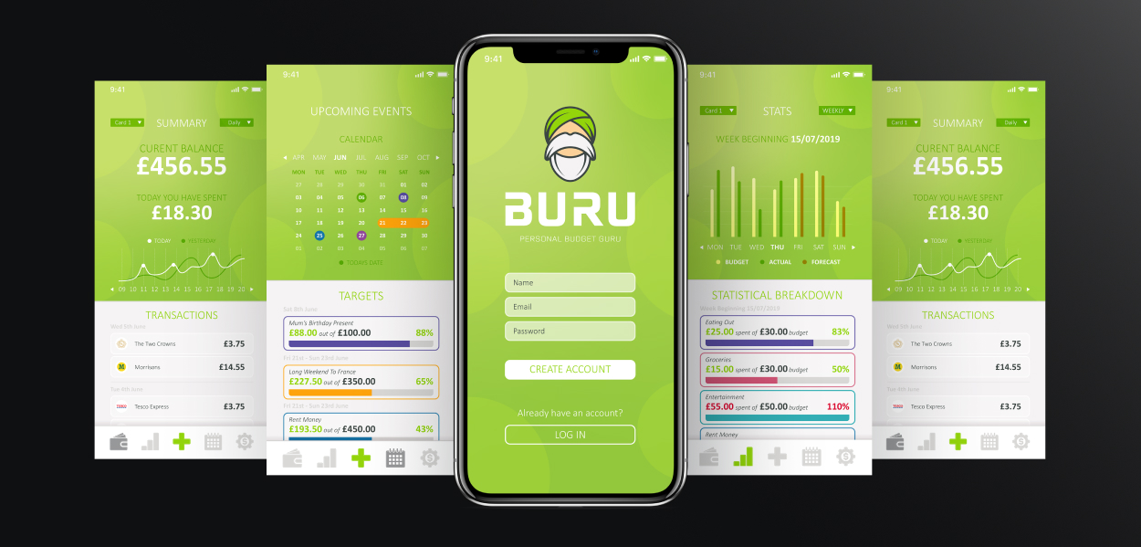
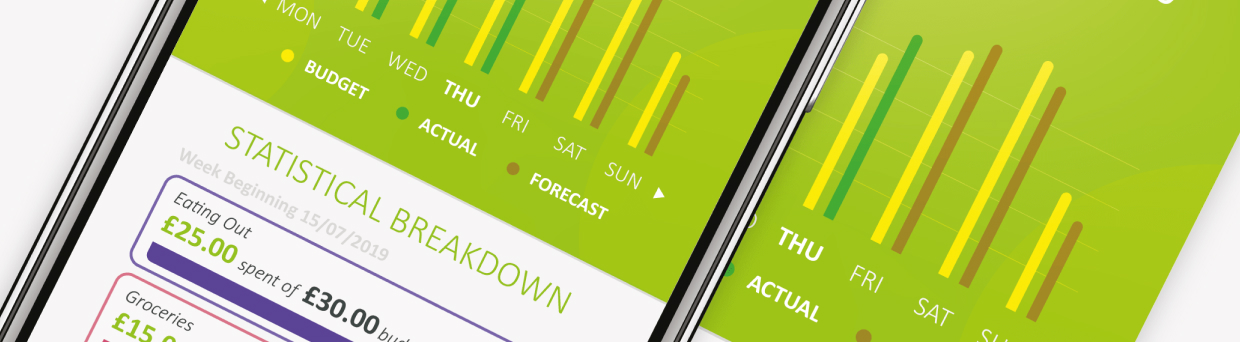
BURU came to me with an excellent concept in mind, however they were struggling to visualise it and imagine how it would all come together. They wanted me to not only create a visual identity that represented their brand, but also create in-app mockups that their team of developers could use as a base. I wanted to keep the brand identity clean and relevant with a user interface that was easy to navigate and required no instructions.
Project Goal
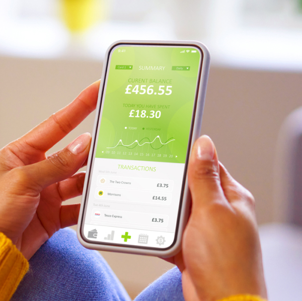
BURU wanted to disrupt the traditional banking apps, feeling them to be pretty boring and lacking any real change since their inception. I wanted to bring some fresh and vibrant design to mobile banking. Initially I had a look at what was working and what wasn't working in the current mobile banking field.


Project Deliverables
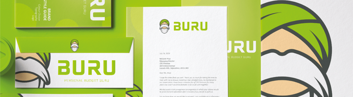
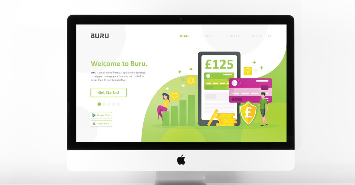
I started off by drafting out some concepts for the logo design. I wanted to keep the logo somewhat playful and relative to the information we had gathered during my research phase. I landed on this minimalist illustration of a Guru. The bold lines and easy to recognise symbol made this perfect for scalability.
I wanted to keep both the typography + the colour scheme simplistic and relevant to the target audience. The bright, vivid green not only relates to money, but it also symbolises youthfulness which ties in well to BURU’s target demographic.