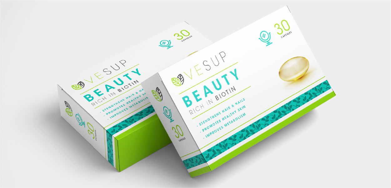
About The Brand
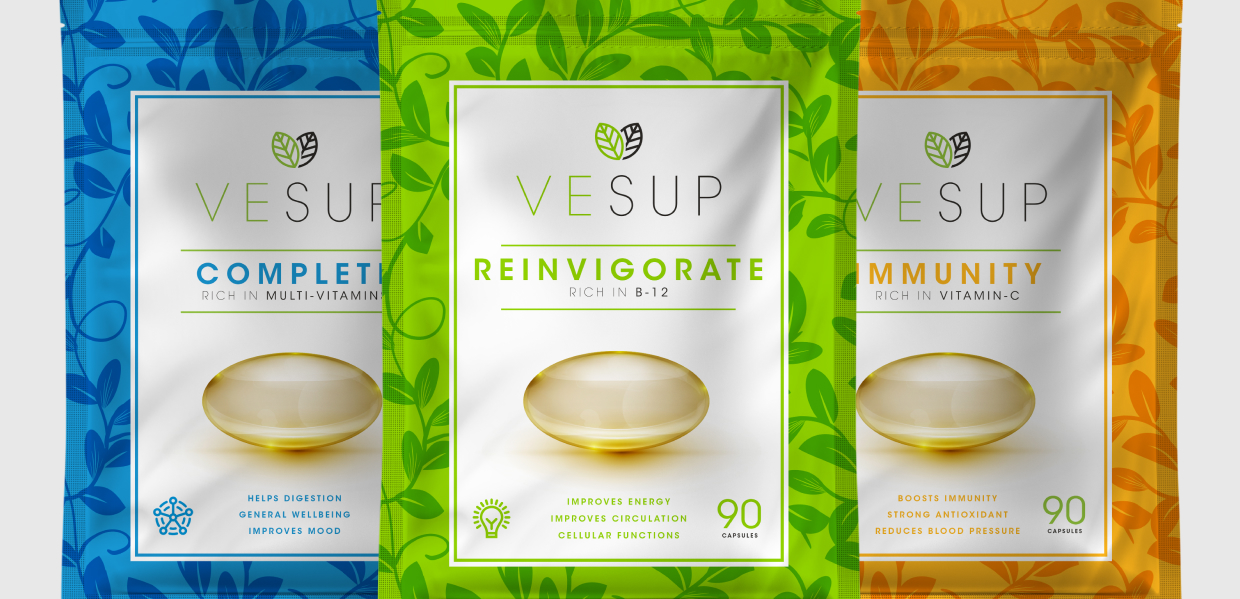
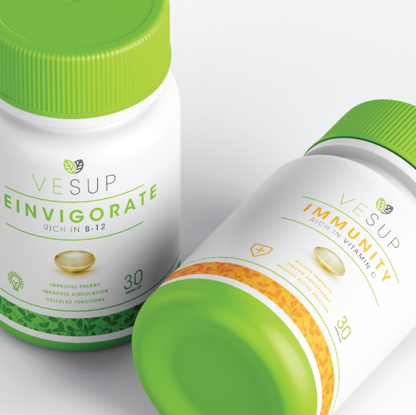
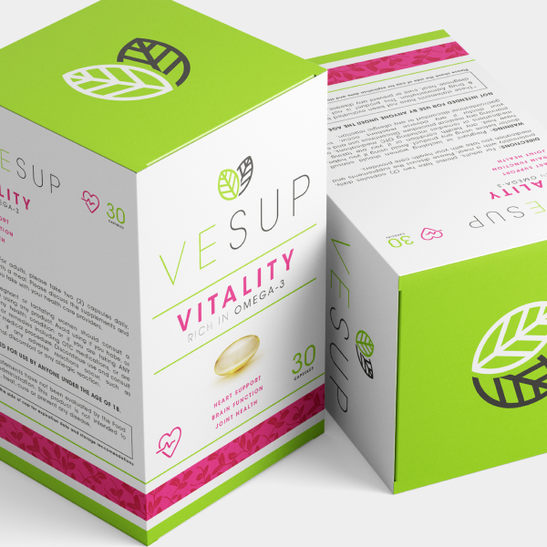
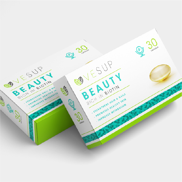
VESUP approached me to create a brand identity that would resonate with both the demographics they are trying to target, Vegans + gym goers. I wanted to make this approachable for both Vegans + people that were curious about the vegan lifestyle. I was asked to create an identity system + packaging design.
Project Goal
Upon some initial research I struggled to find any brands that had successfully bridged the gap between Vegans + Gymgoers. Initially I had a look at what was working and what wasn't working in the fitness industry before proceeding to design an identity that suited.
Project Deliverables
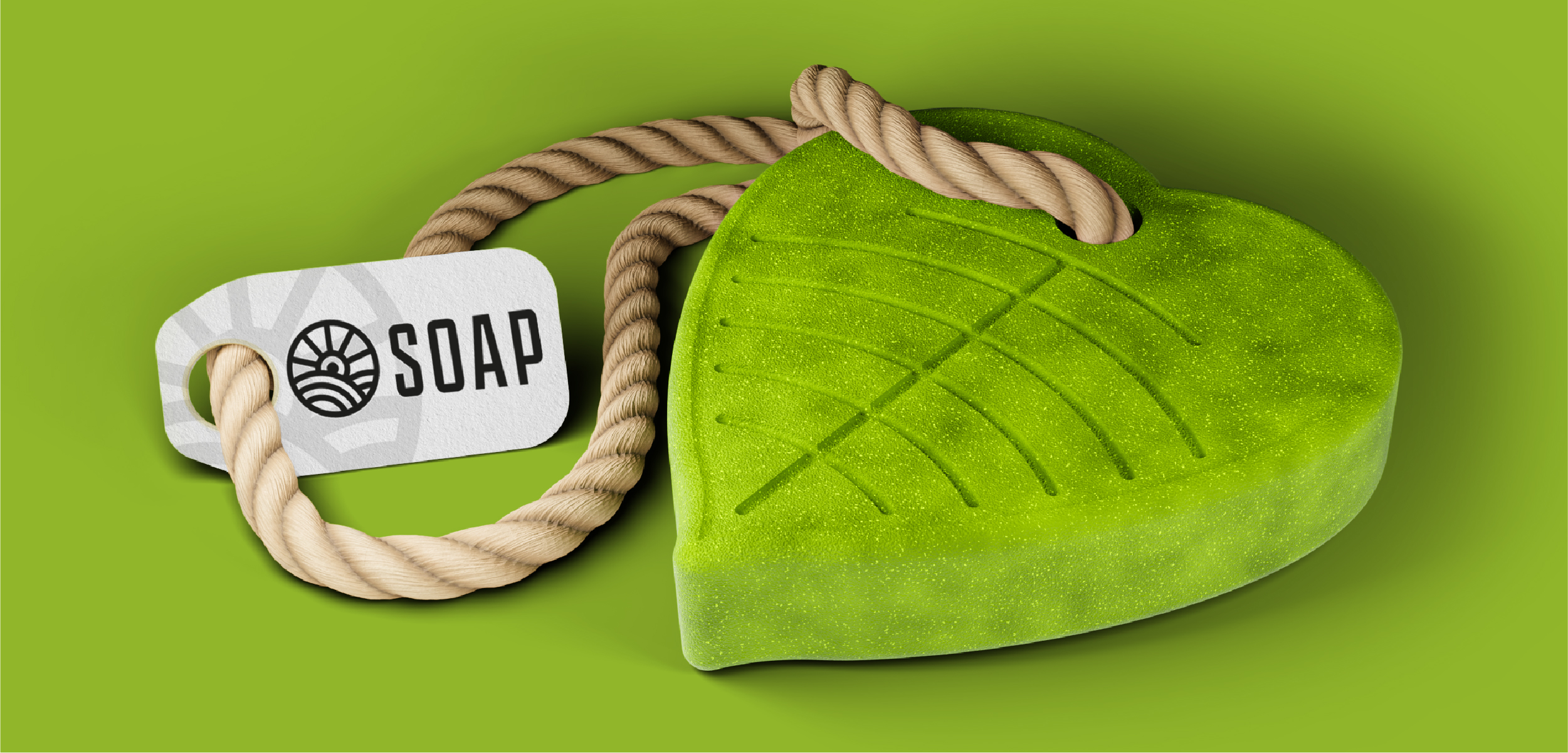
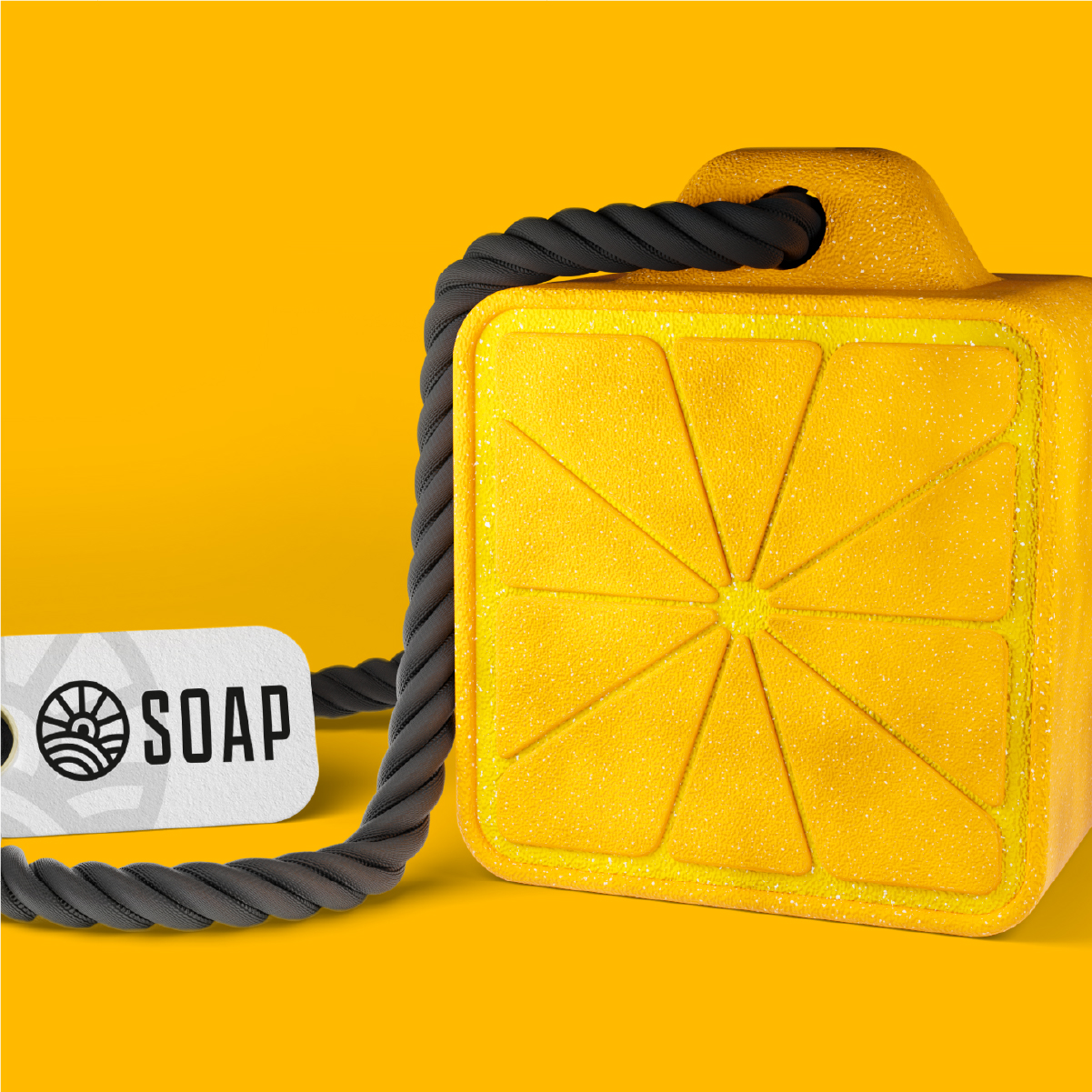
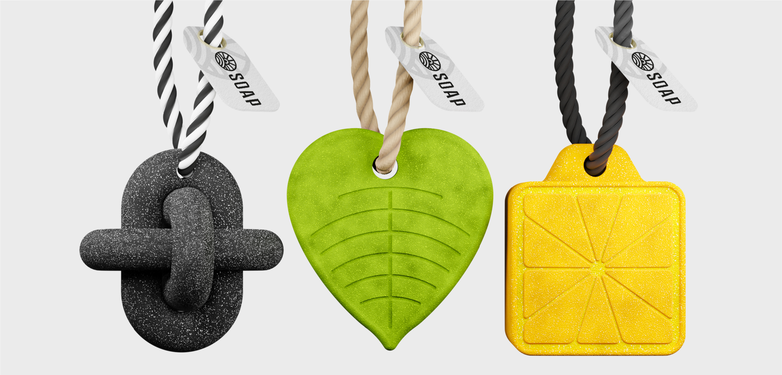
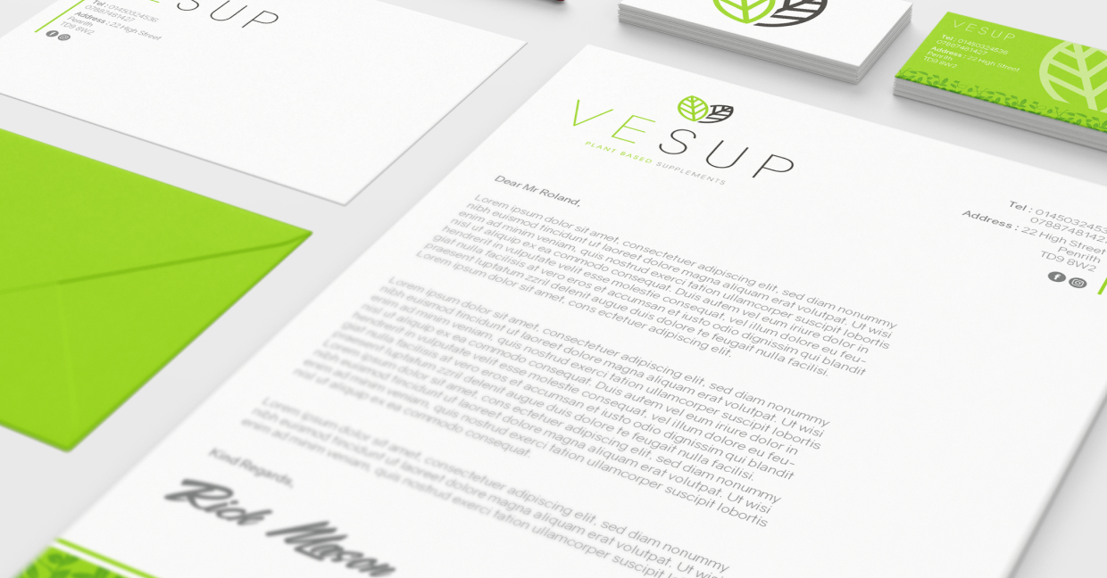
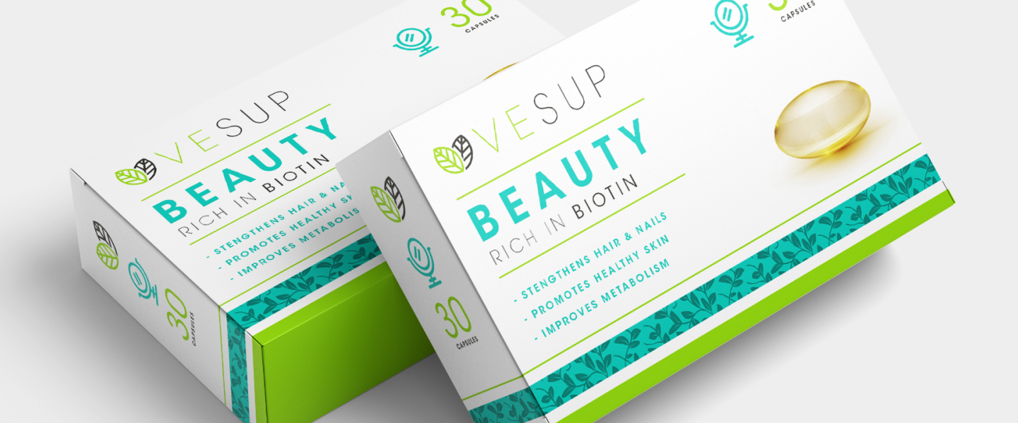
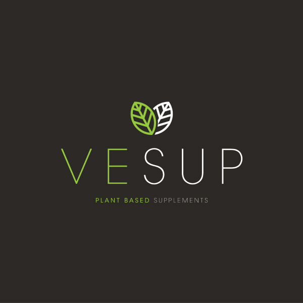
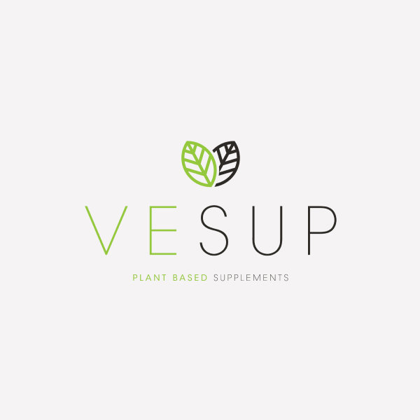
I started off by drafting out some concepts for the logo design. I wanted to combine 3 different elements which were plants, the letter “V” and the colour green to represent plants & nature. For the colour choice I wanted to keep it simple and true to veganism but also with striking elements to help it stand out on the shelves. I chose Avant Garde as the primary font because I feel it has a mixture of natural and bold elements which ties together the Vegan & Supplement markets.